|
| LOGOS |
|
In the Bixio's artistic activity we see the creation of LOGOS for companies,
associations, or single events. Also in this case it's prominent
the searching of a symbology that pass over the first graphics impression.
Here some examples.
|

|
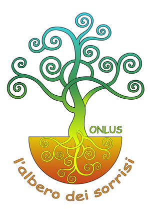
Logo for L'ALBERO DEI SORRISI onlus
The tree of the smiles
This is an association create by companies working in the
Liguria's healtcare sphere to give a real support to persons with
big economic, medical, environemental and cultural difficulties.
The artist thought to adopt the Tree of Life
as metaphore of social grow up.
An eastern concept take up by the tradition of ancient Genoeses mezzari,
as Genoese is the origin of the initiative.
In this case the leafage is stylized, the branches are transformed in spirals,
symbol of infinite and dynamicity, to underline the vocation to actively operate
for a better future.
The colours, transforming from the orange to the yellow,
to the green, to the clear blue,
are inspired by the chakra symbology of India's yoga tradition:
a voyage to rise from the earth to the sky,
from the matter to the spirit, from the body to the mind.
|
|
The roots are mirror-depicted inside a container which shape suggest
a smile profile (repeated by the branches deploy and by the writing)
as a base for the fructification of more new smiles produced by the
association's interventions.
|
|
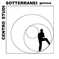
Logo of CENTRO STUDI SOTTERRANEI
two versions
It became from the idea of Leonardo's Vitruvian man applied to
the exploring experiences of the client in the underground of Genoa,
as a synthesis of the armonic relationship, in this case, between
the "hypogean man" and the underground architectural geometries.
It's made of a speleologist silhouette inside two circles tangent to an ellipse,
inscribed into a square, that suggests the concentric arches inside the empty
supporting structure of the Monumental Bridge, in Genoa,
subject of the Centre surveys.
|


|
|
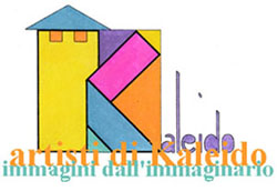
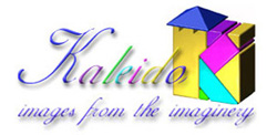
Logo for KALEIDO in two versions
A trans-avant-garde pictorial group which name originate from
the greek language: kalos "beautiful" and
eidos "figure".
The symbol is an imaginary castle which chromatic elements,
as in a kaleidoscope, form the K of the first letter.
|
Original graphics, Indian ink and water-colour

|
Tridimensional elaboration by Corrado Leoni

|
|
Logo for A.SCO.L.T.A. project
the acronym means:
"domiciliary assistance for cardiac decompensation through the advanced techniques of digital communication"
|
on the initiative of the company consortium:
CAEN spa
EVIDENCE srl
EMAC srl
DEVELER srl
SINEGEST srl
Laboratorio ARCHA
Scuola Superiore S.ANNA - Pisa
Centro di Eccellenza per l'Ingegneria del'Informazione e Comunicazione (CEIIC) - Pisa
Dipartimento Cardiotoracico e Vascolare, Medicina, University of Pisa
|

Informatic heart, 2010
|
|
|

